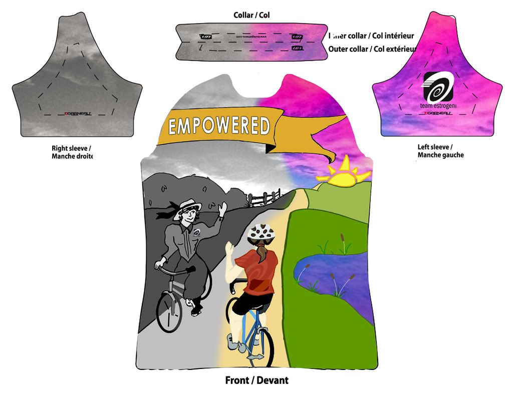
This is for a design a jersey contest at Teamestrogen.com
I'm having a bit of trouble posting my entry on the site though.
I was thinking about the bicycle and it's early contribution to women's liberation. I wanted to try to illustrate that idea in a way, and make something that looks a bit like a vintage bicycle poster.
This is what I've been doing instead of cleaning today. And yesterday. I don't have illustrator at home. I drew the image and then cleaned it up and colored it in in Photoshop.
I still need to create the jersey back and sides.
The idea is that the banner would be high enough on the shirt to come across the upper chest. And, I'm hoping that the cyclists are low enough to be mostly across the abdomen.
Feedback is welcome. Even if this doesn't win... it's good to have a project to work on just for fun sometimes.

2 comments:
I love it. Since you asked for feedback :)
The orange empowered banner color seems a bit out of flow. Play around with maybe greens from the grass or the water based colors.
Maybe a different graphic thing than the banner as is does not flow with the excellent background flow. Play with maybe the bikepath flow for a banner.
Left side of banner has the pinkish color from the right background and then transitions to B&W?
I do love it. Good job.
Sounds good. I can play with the colors... I want to lighten up the classic biker a bit too and add more texture to her outfit.
When I picked orange, I had left some blue in the sky on the retro side... so I thought it'd be cool to have a banner really pop. But, I changed the background and not the banner.
It's cool on the forum everyone is tossing around color suggestions, etc. So, if I can make the image better, I think that I can repost it.
Thanks for the input!!
Post a Comment